bosscat kitchen and libations

menu redesign

bosscat kitchen and libations

menu redesign

*******************

menu redesign

coursework. 2025

illustrator, indesign, photoshop, procreate

research

> when co-owners John and Leslie worked at the Daily Dose, many people assumed he was the head of the operation, when in reality it was her bar: she was the one calling all the shots. after his friends started referring to her as the “Bosscat”, the name stuck.


> from Huntington Beach, California, Bosscat Kitchen & Libations is an upscale casual sit down restaurant and bar (with over 250 varieties of whiskey), perfect for a night out with friends or off-the-clock work gathering.

> when co-owners John and Leslie worked at the Daily Dose, many people assumed he was the head of the operation, when in reality it was her bar: she was the one calling all the shots. after his friends started referring to her as the “Bosscat”, the name stuck.


> from Huntington Beach, California, Bosscat Kitchen & Libations is an upscale casual sit down restaurant and bar (with over 250 varieties of whiskey), perfect for a night out with friends or off-the-clock work gathering.

sketches

> the current logo is expressive but fails to live up to the truly unique name. To respect the creation of the original wordmark, the final edited version has added feline elements and now employs a font used on the final menu as the tagline of “kitchen & libations.”


> For the menu itself, both vertical and horizontal orientations were explored. Keeping in mind accessibility concerns, size of item sections and informational rhythms held precedence. These two sets of sketches were chosen to continue to the comp phase.

comps

> The previous sketches were paired with the selected color palettes, the former, an elevated version of the blue, black, and grey style the current menu uses, and the latter a newly proposed bold, neon red style. Cat motifs within containers were explored during this phase, and after testing and feedback the decision was made to continue with the fresh concept.

font pairings

> Like cocktails and appetizers during happy hour, the menu needed a synergy of typefaces to achieve the desired bold, blackletter punch. Tests of section headings, items names, descriptions, and short subheadings were explored until the perfect combination was found.

digital revisions

> Happy Hour clashing with restaurant logo, hard to read items


> GF and salmonella disclaimers too small and positioned oddly


> “Sweet Tooth” section awkward and extending to edges

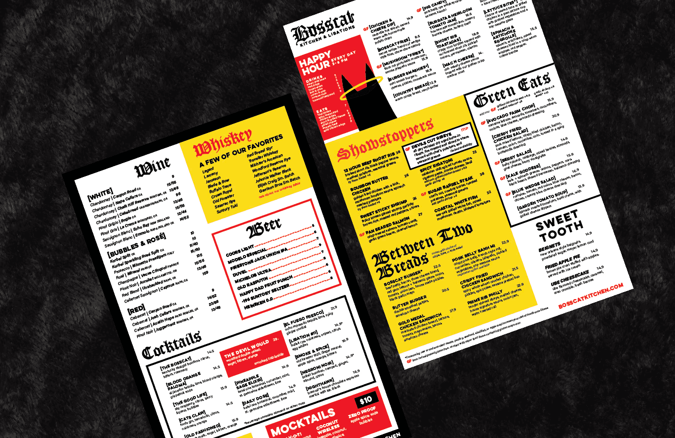
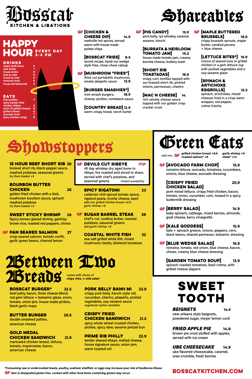
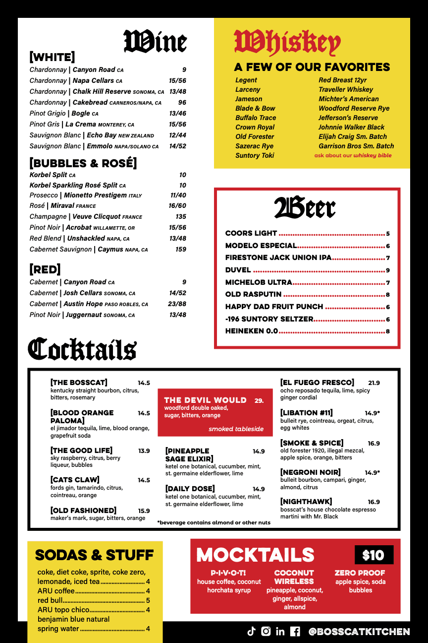
final design

final design

final design

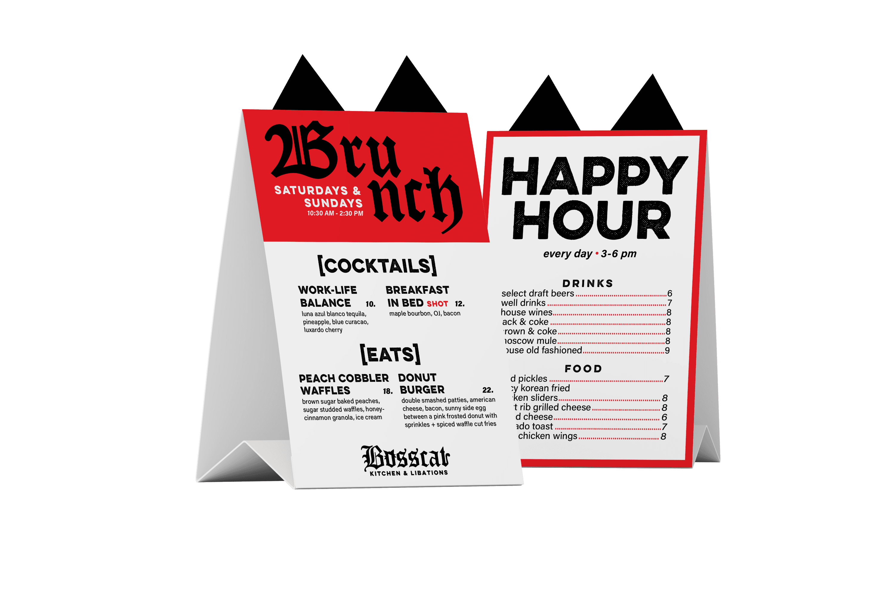
table topper

table topper

table topper

let's get digital

let's get digital

let's get digital

sam fago design (fago design llc, 2026)

sam fago design

(fago design llc, 2025)